

Project overview
The product:
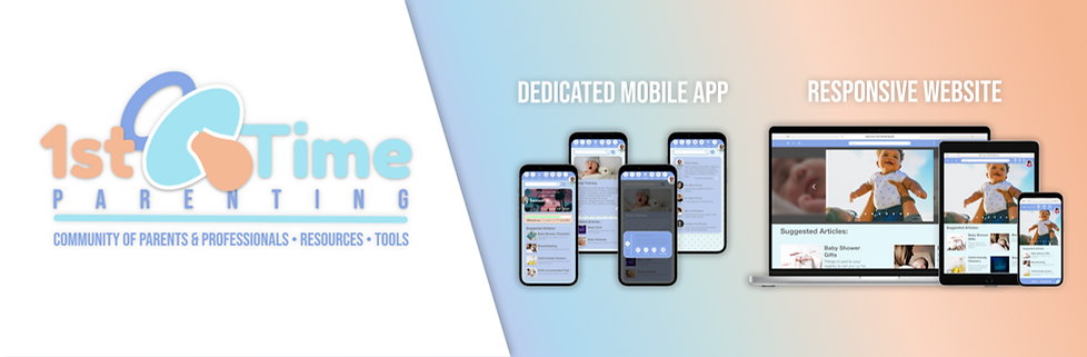
1st Time Parenting is a responsive website & app where parents can find resources - articles, trackers, checklists, and Q&A- and a community of parents & medical professionals.
The problem:
Parents lack time to sift through an overwhelming amount of information and need a reliable source that they can lean on for advice and techniques.
Project duration:
February 2022 to April 2022
The goal:
Design a responsive website & app that streamlines finding reliable information to empower and prepare parents.
My role:
UX designer designing a responsive site & app for parents from conception to delivery.
Responsibilities:
Conducting interviews, paper and digital wireframing, low and high-fidelity prototyping, conducting usability studies, accounting for accessibility, and iterating on designs.
Understanding the user
User research:
I conducted interviews to understand pain points that parents have with finding information to help with their parenting. A primary user group identified through the research were parents (the majority were first-time parents) that have researched topics to help with their parenting.
During my research, I keyed in on my prompt, “Design a user experience to help people learn about being a first-time parent”. I had users search for articles for the main user flow.
Pain points:
1
Opinion, not fact:
2
Filtering:
3
"Needs" are wants:
Users want information that is rooted in fact and not opinion-based.
The amount of information is vast. “Too much information can be overwhelming.”
Users are tired of “you need this” articles which are really unnecessary products.
4
Vague:
Users want information tailored to real-world experiences.
Persona: Sonya L.
![Google UX Design Certificate - Persona [Rachael T. & Sonya L.] (1).png](https://static.wixstatic.com/media/c0ea45_78289ded322f4bab95d319a7235b2d18~mv2.png/v1/fill/w_844,h_474,al_c,q_90,usm_0.66_1.00_0.01,enc_avif,quality_auto/Google%20UX%20Design%20Certificate%20-%20Persona%20%5BRachael%20T_%20%26%20Sonya%20L_%5D%20(1).png)
Problem statement:
Sonya L. is a busy network administrator overseeing multiple networks who needs techniques to get their child on a sleep schedule, because they need to be well rested and focused for work.
User journey map:
Mapping Sonya L’s user journey helped to identify the key interactions for finding a particular article in the app.
![Google UX Design Certificate - User Journey Map [Template] (2).png](https://static.wixstatic.com/media/c0ea45_69122ea114424247bd338bbdaad72d91~mv2.png/v1/fill/w_843,h_473,al_c,q_90,usm_0.66_1.00_0.01,enc_avif,quality_auto/Google%20UX%20Design%20Certificate%20-%20User%20Journey%20Map%20%5BTemplate%5D%20(2).png)
Starting the design
Paper wireframes:
Brainstormed the homepage layout for multiple screen sizes.

Paper wireframes:
Brainstormed the homepage layout for the dedicated mobile app.

Digital wireframes:
While designing, I chose to add a carousel to the homepage to cycle through images corresponding with articles. I intentionally added this feature so users could see possible article of interest.
Digital wireframes:
I made the same design choices, but had to line the discover and network sections into one column to adapt to the screen of a mobile device.


Low-fidelity prototype:
I used the digital wireframes to model my low-fidelity prototype. The main user flow of the site was centered around the the profile creation and update process, so I connected this flow in order to study this process in the usability study.

Low-fidelity prototype:
I used the digital wireframes to model my low-fidelity prototype. The main user flow of the site was centered around the the profile creation and update process, so I connected this flow in order to study this process in the usability study.
Usability study: parameters
Study type:
Unmoderated
Location:
Participants:
Remote, US
Three males, two females between the ages of 30-45.
Duration:
5-10 minutes
Affinity map:

Usability study findings:
The findings from the usability study aided the direction I took to change my wireframes to mockups, then to the high-fidelity prototype.
Findings:
1
Users want a minimal, clean app with on screen controls at the top.
2
Users need more directions/ cues of how to complete the flow.
3
Users wanted a confirmation message to validates the user’s intentions before posting an article to the feed.
Refining the design
Mockups:
In my initial design, I had a share button on the article page that posted the article to the user feed. After the study, I added a confirmation page for posting articles to the feed. This would prevent accidental posts.


High-fidelity prototype:
The website and app final high-fidelity prototype presented a clear profile creation and update flow. I also flushed out the discover, network, and Miguel’s profile page.


View the 1st Time Parenting:
Accessibility considerations:
1
Accessibility was considered through the color palette choice and contrast. The colors in the app were tested and align with Web Content Accessibility Guidelines.
2
Accessibility was considered throughout the user flow in the prototypes when making connections. Multiple ways were created to navigate through the app.
3
Accessibility was considered through the wide-range of devices the app was created for.
Going forward
Takeaways:
Impact:
The responsive website and app allow the users to connect with other parents and medical professionals to get information about parenting.
Quote from peer feedback:
“Babies aren’t a one size fits all, what works for one child may not necessarily work for another.”
What I learned:
While designing the 1st Time Parenting responsive website and app, I learned the app and website do not have to be direct matches of each other.
Next steps:
Conduct another round of usability studies to confirm that the last iterations addressed the users pain points, and iterate design according to the findings from the usability study.